Typefaces
Gala
I created this shortly after I started my design Instagram page. I follow a paged called GoodType. The page has the call to action "Strength in Letters". They give their follows a challenge to create a typeface, post it to Instagram, and tag them.


I thought of this design on a whim. A curved 'A' kept popping into my head, so I decided to create a whole title face to go along with it.
In case you missed it, (I did at first) I had created my ‘J and Z... BACKWARDS. Instead of deleting everything I had posted on social media, I decided to run with it and create a video poking fun at it. Everyone makes mistakes, but it’s how you react to those mistakes that define your character. In this case, it defined my ‘J’.
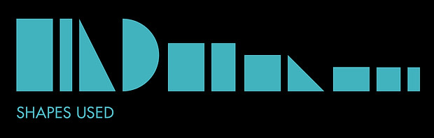
Junction
Junction consists of a series of transparent shapes overlapping each other that give the illusion of a character. Very much a Title Face that I envision being used in unique, futuristic environments.